The Insights page allows you to monitor your portfolio’s progress, identify optimization opportunities, and fine-tune your strategy for maximizing revenue and occupancy.
This document outlines the steps for analyzing and interpreting data graphs and charts. This involves understanding key metrics, comparing historical and current data, and interpreting revenue and occupancy trends to effectively gauge business performance and make informed forecasts.
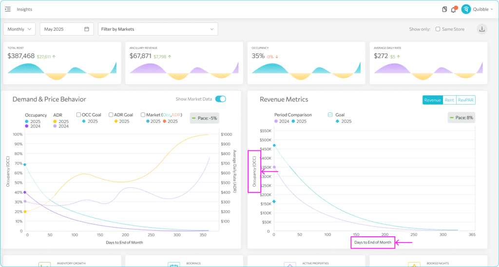
1. These graphs illustrate the values from the first layer cards. These graphs show trends over time. The data should read from right to left with the X-axis representing the countdown of days until the period ends where day zero represents the last day of the month.
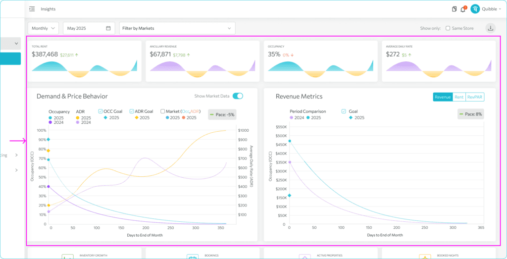
2. The gaps in the graphs represent the difference between the current point and the point where we were last year which are comparison values from the first layer cards. On the far left, you’ll see forecast dots for the current year. These give you an early signal of where the period is expected to finish. You can also hover over any point on the lines to see the actual values.
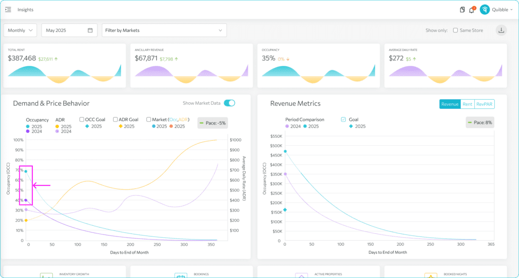
3. The Demand and Price Behavior graph illustrates the occupancy trend and average price trend. These are displayed alongside the previous year’s numbers, which help forecast the future. The chart displays occupancy and ADR for both the current year and last year, so you can compare this year’s performance against last year — across both demand and pricing.
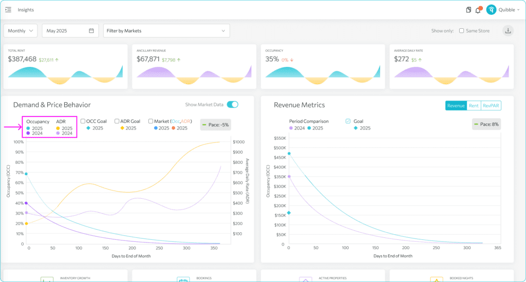
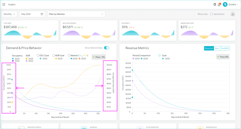
4. On the left side of the chart, we’re tracking Occupancy, or how much of your inventory is booked. On the right, we’re showing ADR — Average Daily Rate — in the currency set for your portfolio.
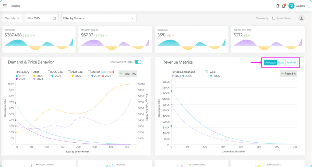
5. Meanwhile, the Revenue Metrics graph provides insights into revenue, rent, and RevPAR. Just like on the other graph, the X-axis shows the number of days left until the period ends, while the Y-axis displays revenue, in the portfolio’s set currency.
6. You can toggle between Revenue, Rent, and RevPAR at the top. Revenue is the rent plus the ancillary or additional fees for the selected period. The Rent refers to just the nightly rate, while RevPAR serves as a unit of measure to indicate how much money they are making per night.
7. The cards at the bottom of the charts shows the portfolio statistics.
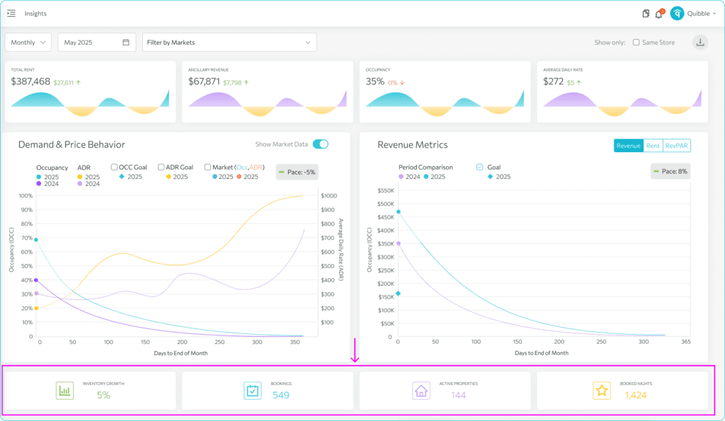
8. Inventory growth is the number of available nights this year compared to last year.
Bookings refer to the total number of reservations within the selected period.
Active Properties denote the number of properties actively listed through the property management system.
While, Booked Nights shows the total number of nights booked within the selected period.
If you have further questions or need additional assistance, our support team is here to help. We hope this has helped you better understand and interpret the data graphs and charts.
Don’t forget to explore our other help articles and resources for more insights into managing your pricing strategy.